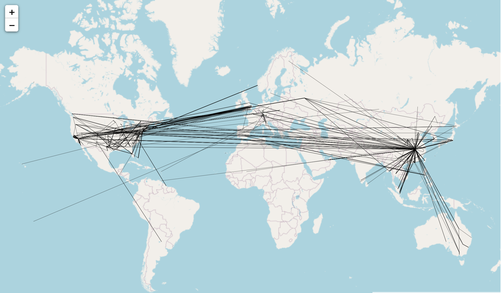
In this project, I aimed to visualize and comprehend the spread of the coronavirus pandemic globally, by employing graph theory and network science. Using data of over 3000 patients, and their recent travel histories, I mapped out potential locations each patient could have contracted the virus, and spread the virus to. Furthermore, I used community detection to examine which locations were commonly visited, and used graph embedding to learn and predict which locations could be potential future hubs.
Github
This was my submission for the inaugural data science hackathon hosted by the Data Science department at the University of Washington, for which my team won first place in the Data Visualization category. In this project, we allowed users to explore COVID-related data on number of cases/deaths, and policies governments have enforced to mitigate the effects of the virus. The dashboard also includes interactive visualizations to demonstrate how people have responded to the pandemic in the United States.
Github Write-Up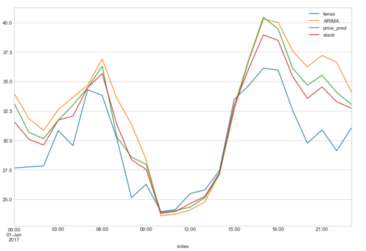
We built a dynamic time series model to predict price trends for renewable energy by evaluating risks in developing renewable energy infrastructure, emphasizing long-term accuracy and adaptability to significant economic events. After scraping unstructured government data, we consulted industry professionals for domain knowledge, and built a robust and highly accurate ARIMA model to predict future prices.
GithubFeel free to contact me. I would love to chat! You can reach me at tiwaristiwari97@gmail.com or any of my social links below